Going along with our training session, now we’ll be going over some key layout updates and what may have changed with the introduction of global styles, including but not limited to:
With a lot of changes, revisions, and improvements over time, the need to modify section padding, margin, and position has lessened, but often comes up after a site has gone live. There are lots of different settings that all work together to help control the flow of the page, but they’re easier to use once you break them down a bit further!
Global styles on newer sites have removed some of the need to customize section by section, but this is still incredibly relevant given the volume of sites we have that do not have any global styles incorporated.
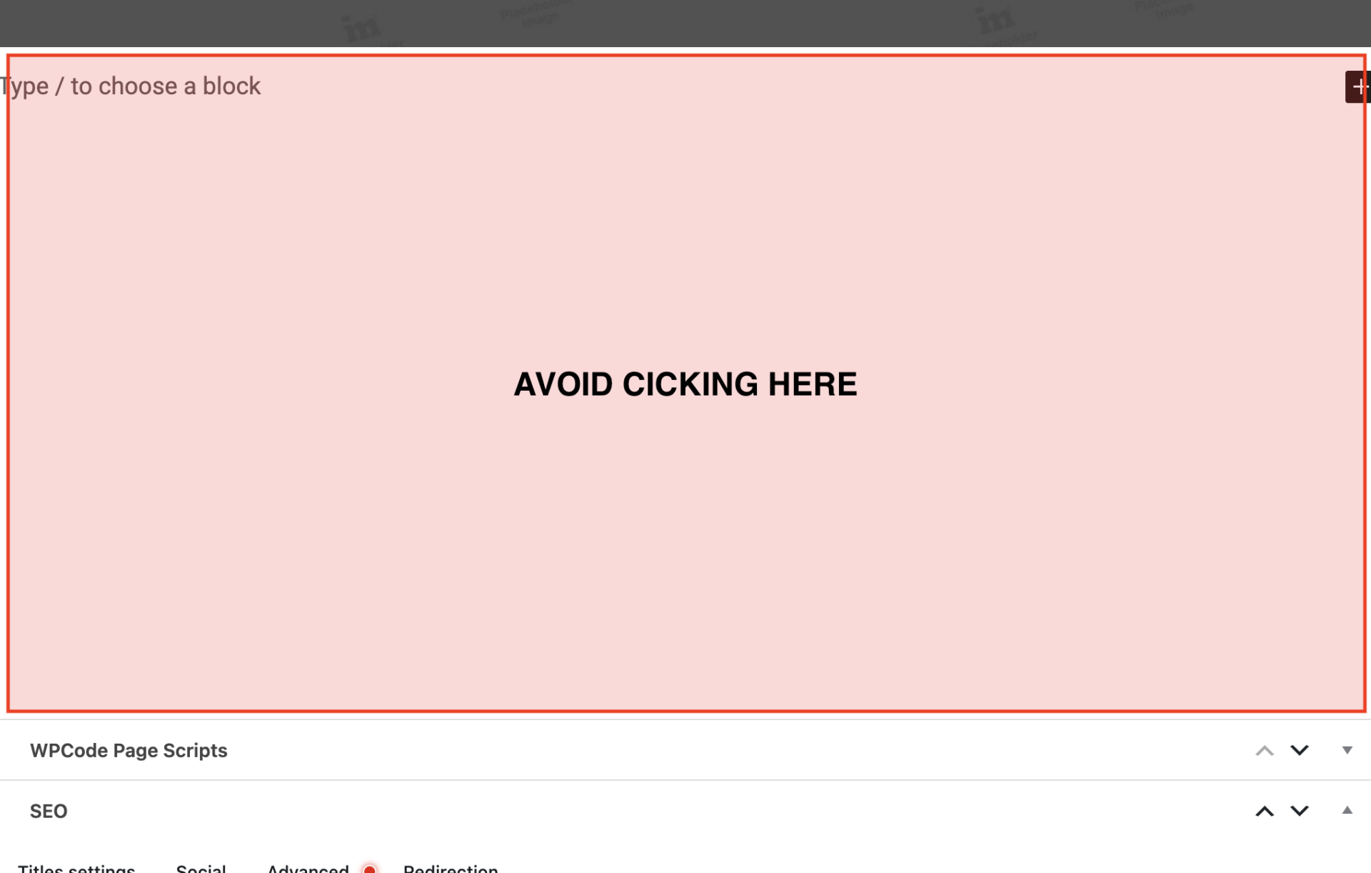
Try to avoid clicking into the large blank space that shows up under our page content.
If you begin to see Type / to choose a block, but don’t add any new content, it will leave an extra blank space somewhere in a section or at the bottom of the page, and can cause 1 page to need further revisions during QA vs others, which is something we want to avoid.
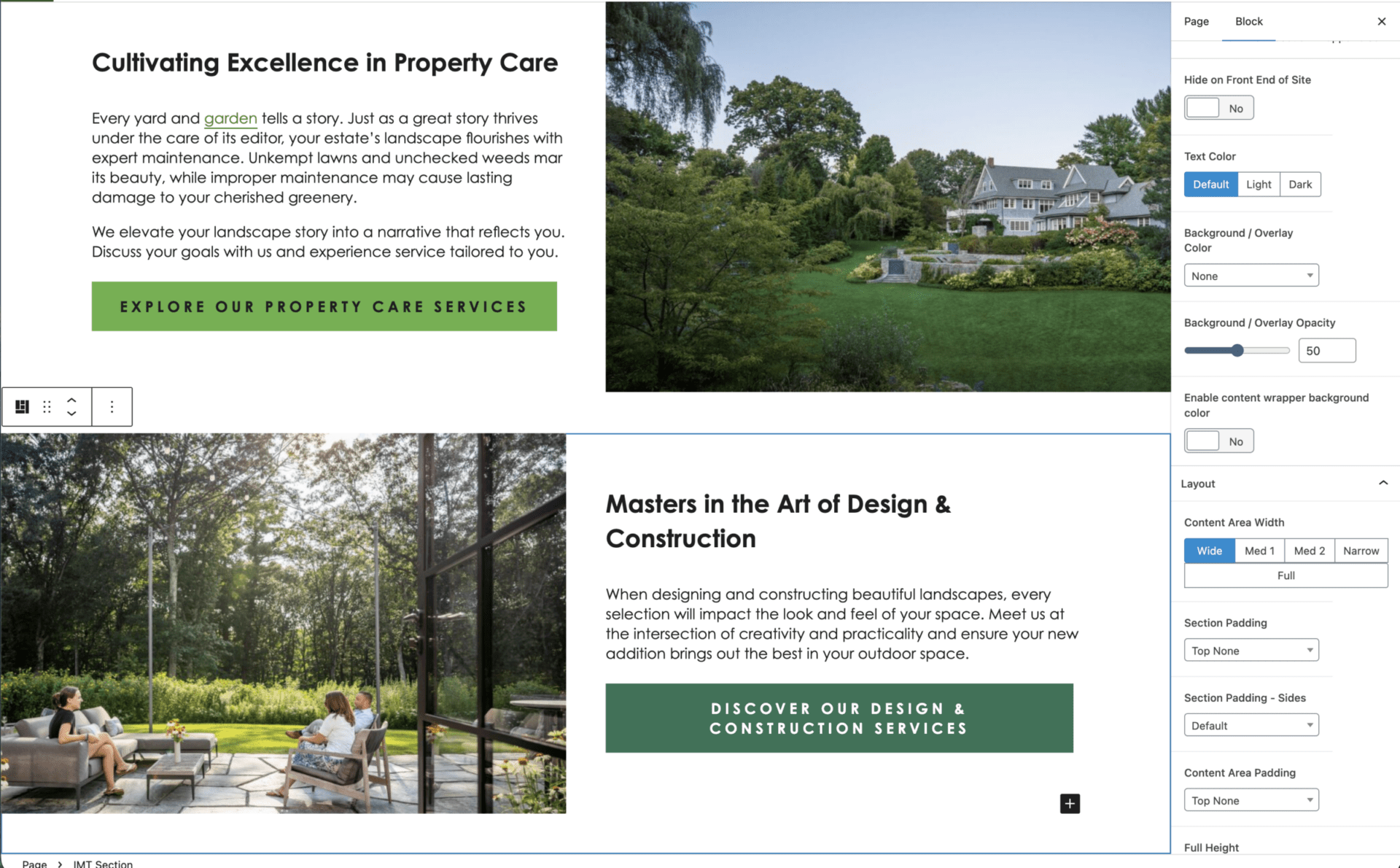
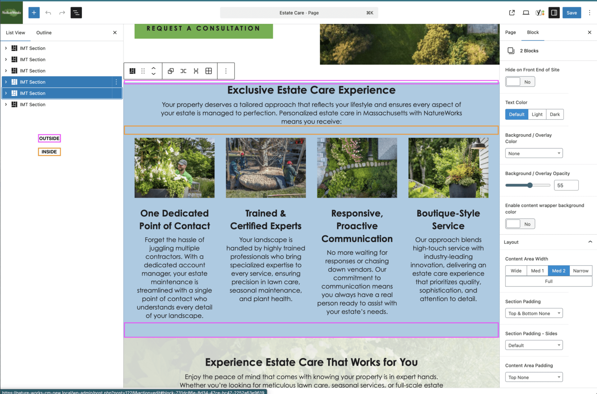
These values come from the way sections are set up with nested elements.
IMT Section has inside of it a section that we will refer to as IMT Content, this is a wrapper around the things inside the section, e.g. a media row.
The Section Padding applies to an outer wrapper – the Section.
The Content Padding applies to the inner wrapper – the Content.
Values wise, Content padding is typically 1/2 of the Section padding, so depending on if you need more or less padding, you can use different options.
You have 3 parts of padding for the top, and 3 parts of padding for the bottom. Section padding controls 2/3, Content padding controls 1/3.
Typically, we turn off both top values and leave both bottom values active when setting up sections back-to-back.
Some site styles may differ as the top and bottom padding are turned off entirely – but they can still impact other layouts.
Typically, the warning signs that you’ll need to make a change are:
One of the best places to check is another section on the page to confirm if we’re using both values, only one set, none of them, or some other combination thereof.
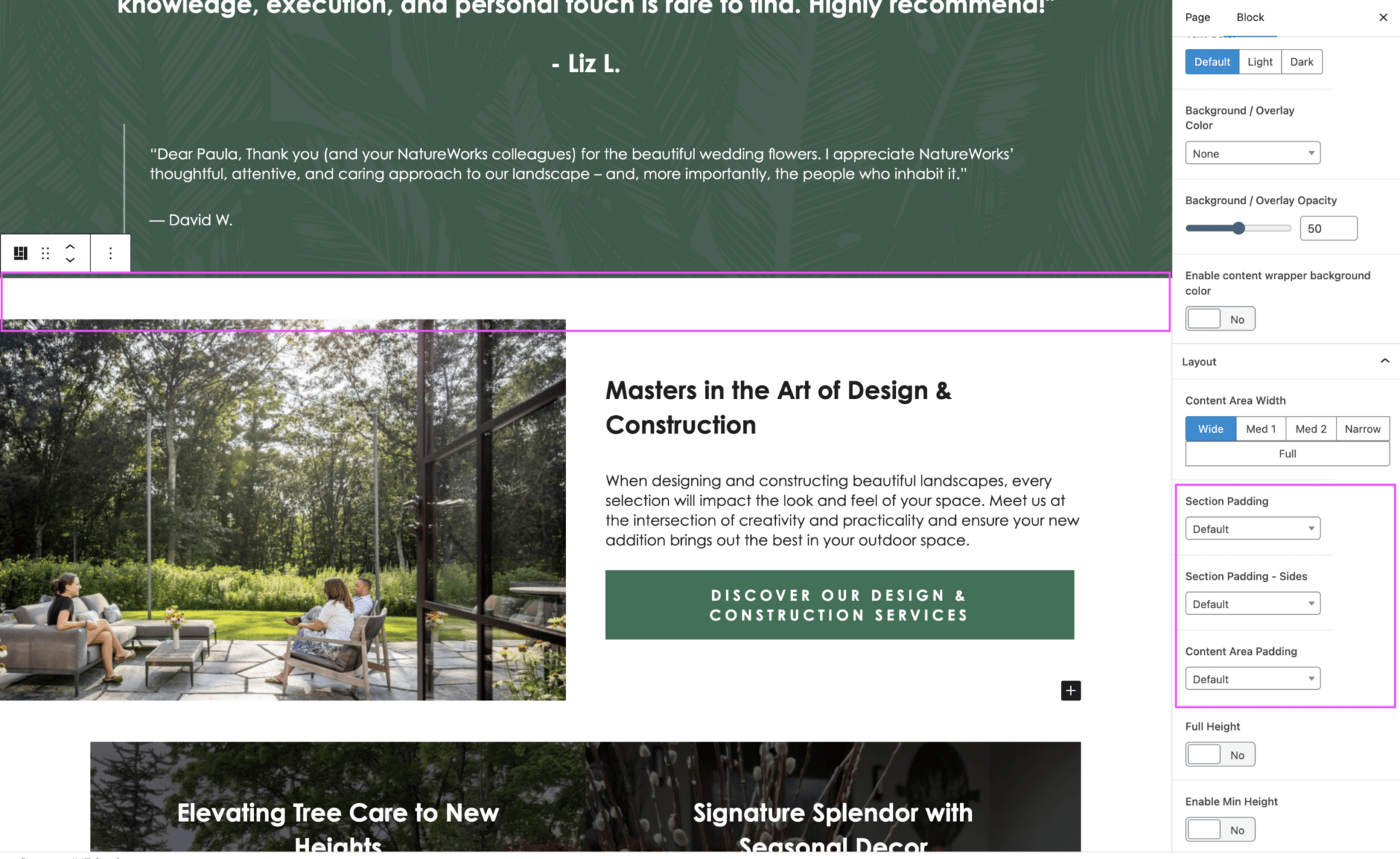
Below, if we decided we were going to move the testimonials to in between the 2 media rows, you’ll notice the padding goes awry:
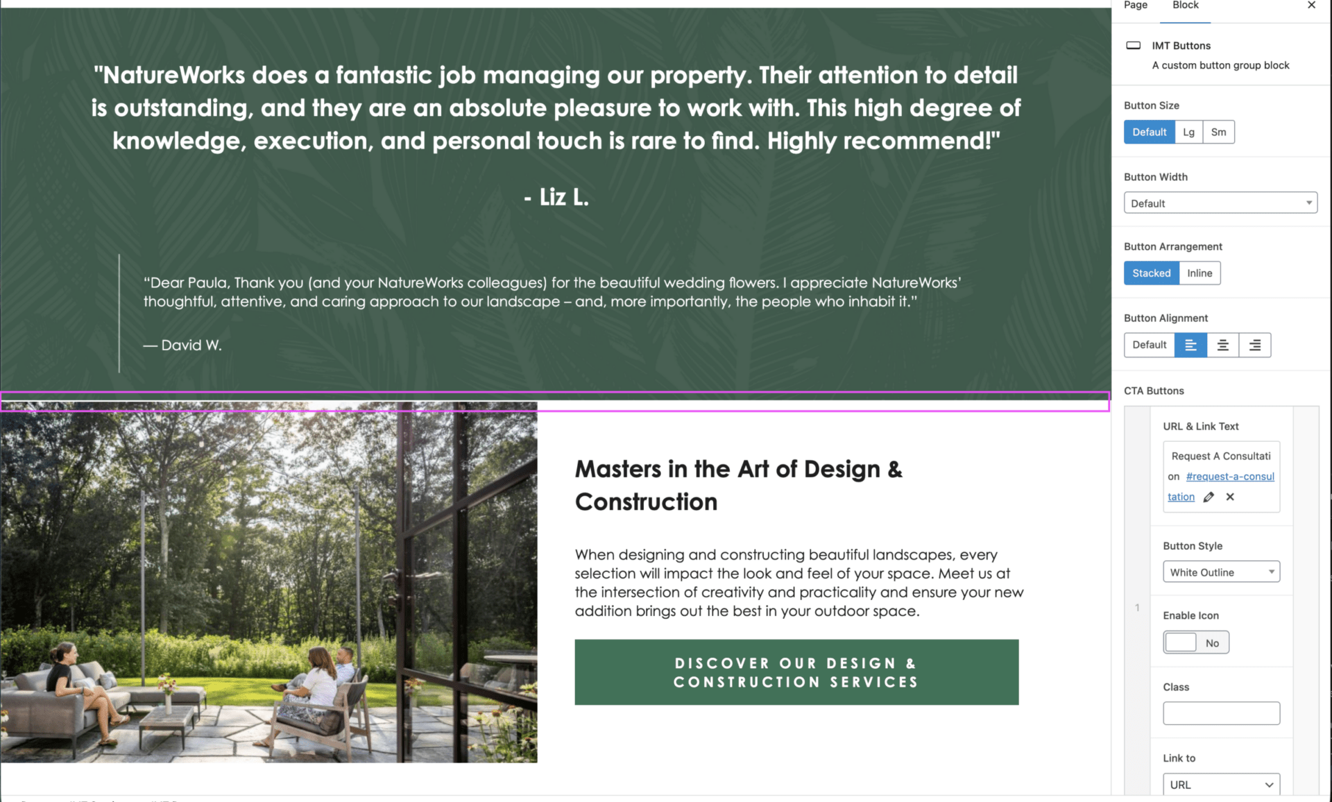
This happens because previously, the spacing for equal padding was coming from the section above it, which has now changed to a section that is visually intended to be a full section across the page.
What we need to do is compare to the media row above, see that it’s got top padding for both options, and set it for that 2nd media row. This will now solve the issue.
When in doubt, you can always see how similar sections were structured on another page, prior to requesting design support. Often, a similar layout has been implemented on another page already, and you can copy directly from there before trying to update it manually.
The same logic applies, with minor differences.
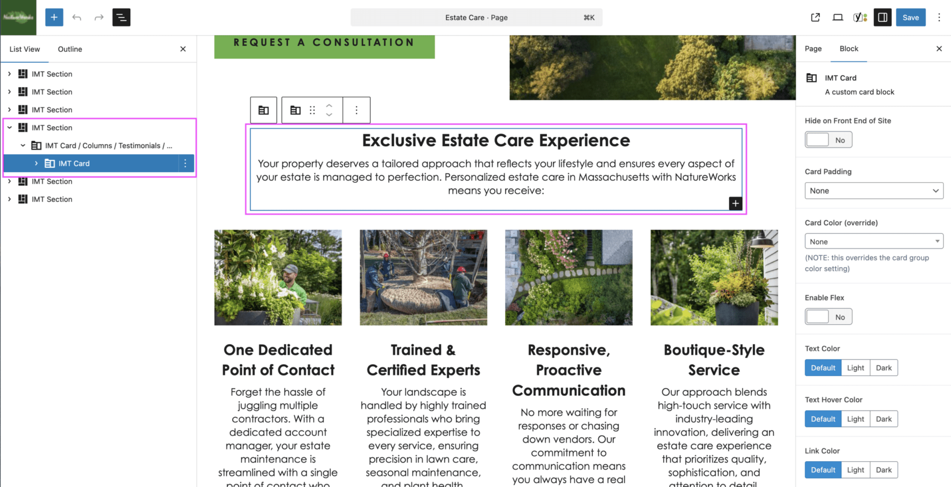
There are 3 main components that make up a card group:
On the outer sections, so the top of the introduction, and the bottom of the button, you want those to follow the same logic as we just discussed.
On the inside, the bottom of the introduction and the top of the button, we typically want these values smaller, as it helps visually connect the 2-3 sections together. Without it, it can give an illusion of floating buttons or text.
A good rule of thumb is for any inside padding, you want to use Content padding only.
For outside padding, you typically want all or nothing.
If you need to create a new section, always copy from elsewhere on the site if you haven’t been able to duplicate a page template itself. These should always have a baseline set of styles applied (background, padding, card style, expected number of cards, etc.) already, which can save you time in trying to figure out how to make it work.
Global styles are exactly that: styles applied globally. These are styles that have been overtaken by theme settings, rather than having them managed page by page.
These have been implemented due to shifting needs and the requirement to keep up with OTT now taking use of the Content Imp, and makes it easier for design to control styles across multiple pages without having to edit each individual section. This does not, unfortunately, mean that there will be no issues. Global styles currently:
Because of the media row padding settings in particular, this can often mean card groups or other related sections like the associations carousels need a bit more attention and care when being used on a page, and may either need to be shifted or adjusted to suit all possible layouts.
Global styles for card groups are coming to sites near you in 2026.
Global styles are managed via classes. This means that if they are genuinely not working and taking too much time during the design stage of a build, these classes can be removed and the previous styling approach can be used.
This should never be done after a site has gone live unless by a designer.
The refresher here is on the topic of all content items and images exists in a card or we don’t add it to the page.
Without adding content inside of a card, we lose accurate control over its styling and formatting, and as we move to a more global approach, it can cause critical display errors that will lead to unhappy designers and clients.
We want to ensure that we’re adding content items, IMT heading, IMT paragraph, IMT buttons, and IMT images inside a wider, single card layout. This also encompasses forms, and any introductory or supporting content. While there can be points of formatting errors, you can often add headings, paragraphs, images, and buttons within the same card, unless it needs to be split up around other content.
Certain elements on a page, such as a media row, the gallery blocks, and testimonials slider do not strictly require card groups, as they have their own parent wrappers that help control and contain their content. These should by default be added already within an IMT section, but if not, should always be added to one.
The single content and image exemption from this rule is imported blogs – realistically, these would all be converted to the correct format and layout, but this is often out of scope of our projects.
If you’re adding content to a page and it isn’t in inside of a card, it shouldn’t be added to the page.
Many sections that you may need exist all across the site, and can be copied and pasted in where you need it instead of trying to add a new section and match the styles.
Always check if it exists already to save time!
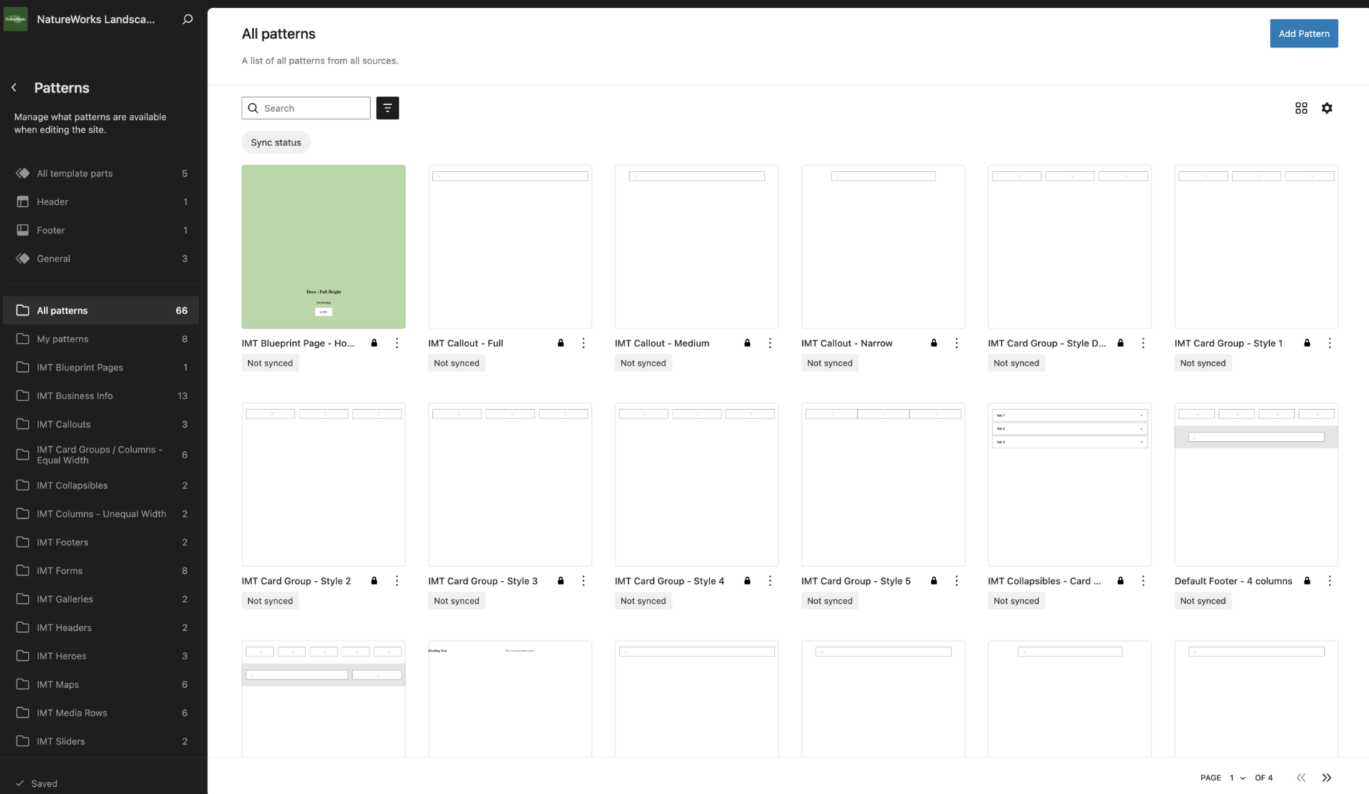
You can access patterns by navigating to Edit Site in the admin bar if you’re on the front end of the site, or via Appearance > Editor if in the wp-admin view.
In the new screen that you navigate to, you’ll want to either select Patterns, if you see it, or click the back arrow on page, not of your browser, and then select Patterns.
This is where you’ll find key patterns like the sticky button bar, the header, footer, and a very, very useful search bar.
We have lots of elements that get saved as patterns, from the unsynced building blocks of cards, media rows and more, to the synced patterns we reused across multiple pages.
Common patterns you may search for include:
Alternatively, you can always feel free to navigate to the page you’re looking to edit a section on, select the pattern, and click Edit Pattern in the popup.
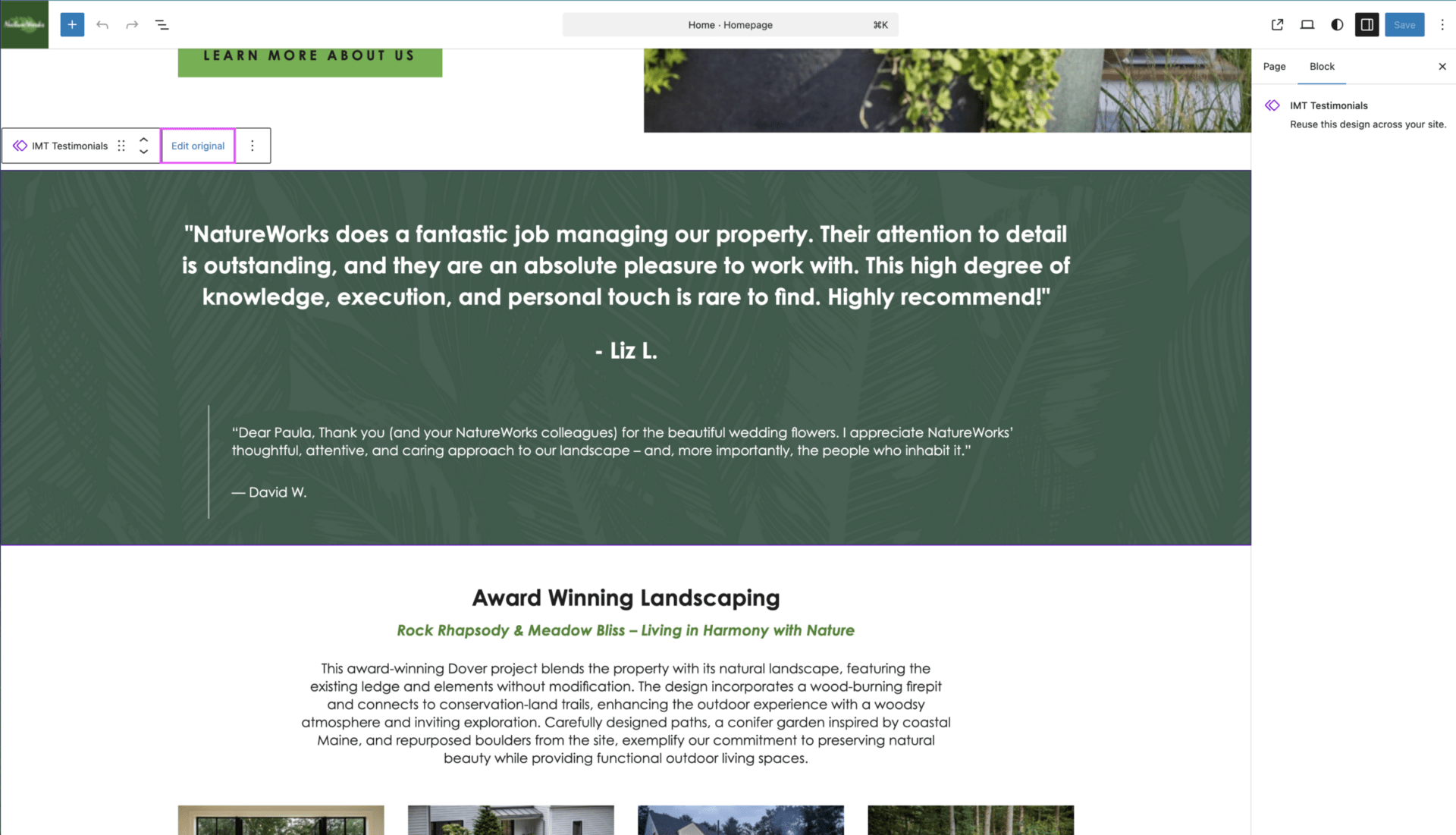
Alternatively, you can always feel free to navigate to the page you’re looking to edit a section on, select the pattern, and click Edit original in the popup.
We’re working on consistency – all used patterns on a site from copy patterns to final, fully designed ones are intended to be labelled with a preceeding _, to help push them to the top of the list when reviewing for Imp generation.
While not guaranteed to be fully functional, we will slowly be working on adding to the process to remove unused patterns from the site being worked on to help reduce future confusion.
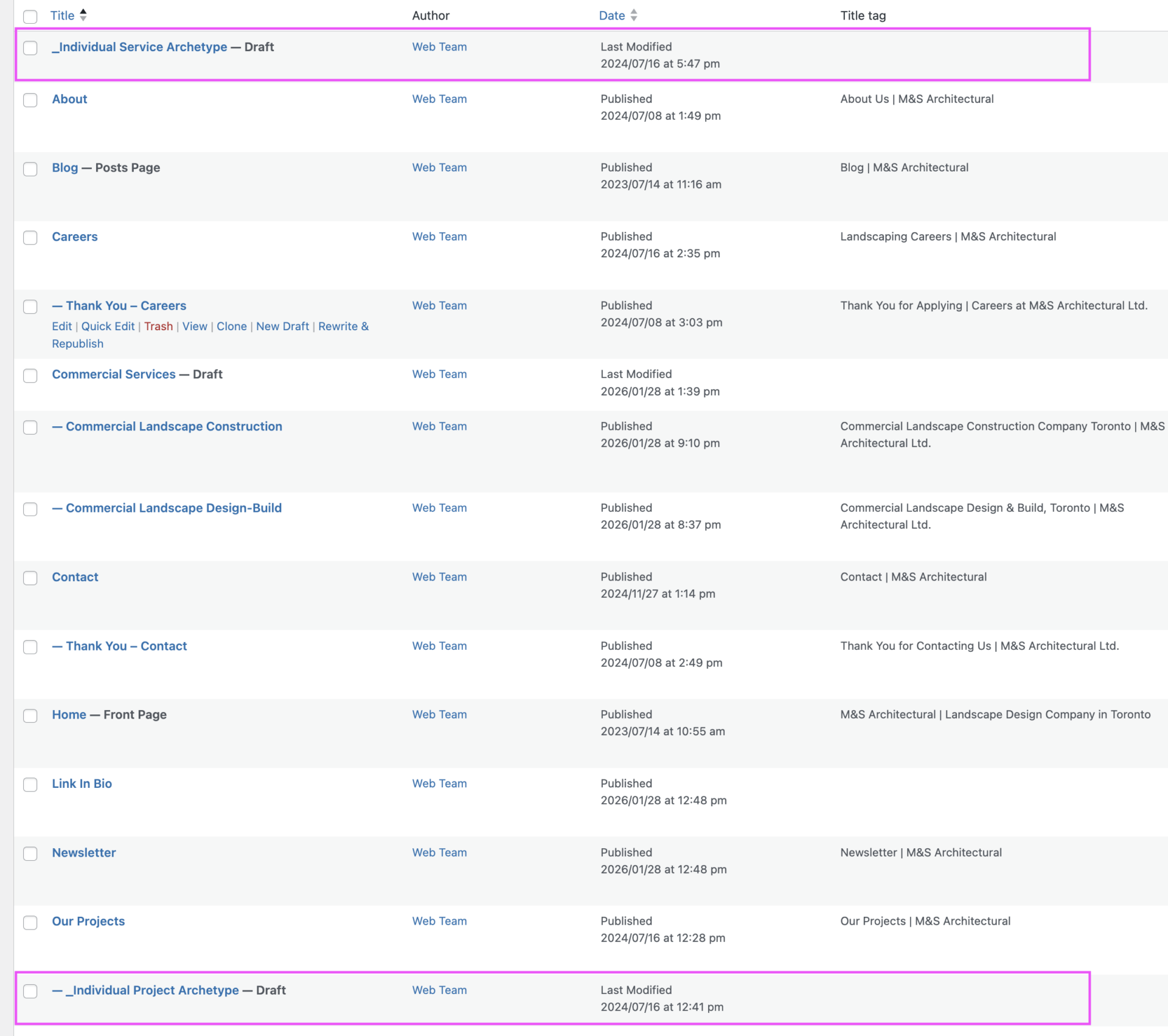
After and oftentimes during a web build, we get an upserve for additional pages. Certain key pages receive an archetype or template saved as a draft in the backend of the site. This process has been active for quite some time now, and these pages are intended to be kept up-to-date and re-saved as the Imp wireframe should changes be made during QA or post-client review.
These pages make it much easier when the cases come in for OTT (or someone else on the team taking on the work) to be able to duplicate and create the pages they need without needing to wait for design intervention.
These pages should already be generated as Imp wireframes for any pages needing to be generated after a site has gone live, unless the site was create pre-Imp use.
If your site does not contain saved archetypes, please loop in design only if copying an existing service page and replacing the content is not feasible.
If your site does contain saved archetypes but you notice discrepancies between the new pages and the live pages, please tag in design, as we will need to make updates to both the page and training processes to reduce the risk in the future.
If you need to make a new archetype from an existing page, the best approach is to create a new draft of that page. Doing so will ensure you can then:
This will ensure we have the best implementations set up for our
If you are re-using an already converted page for your new page, it’s great to triple-check that ci-card-start and ci-skip are still applied. It should be, but technology can be weird.
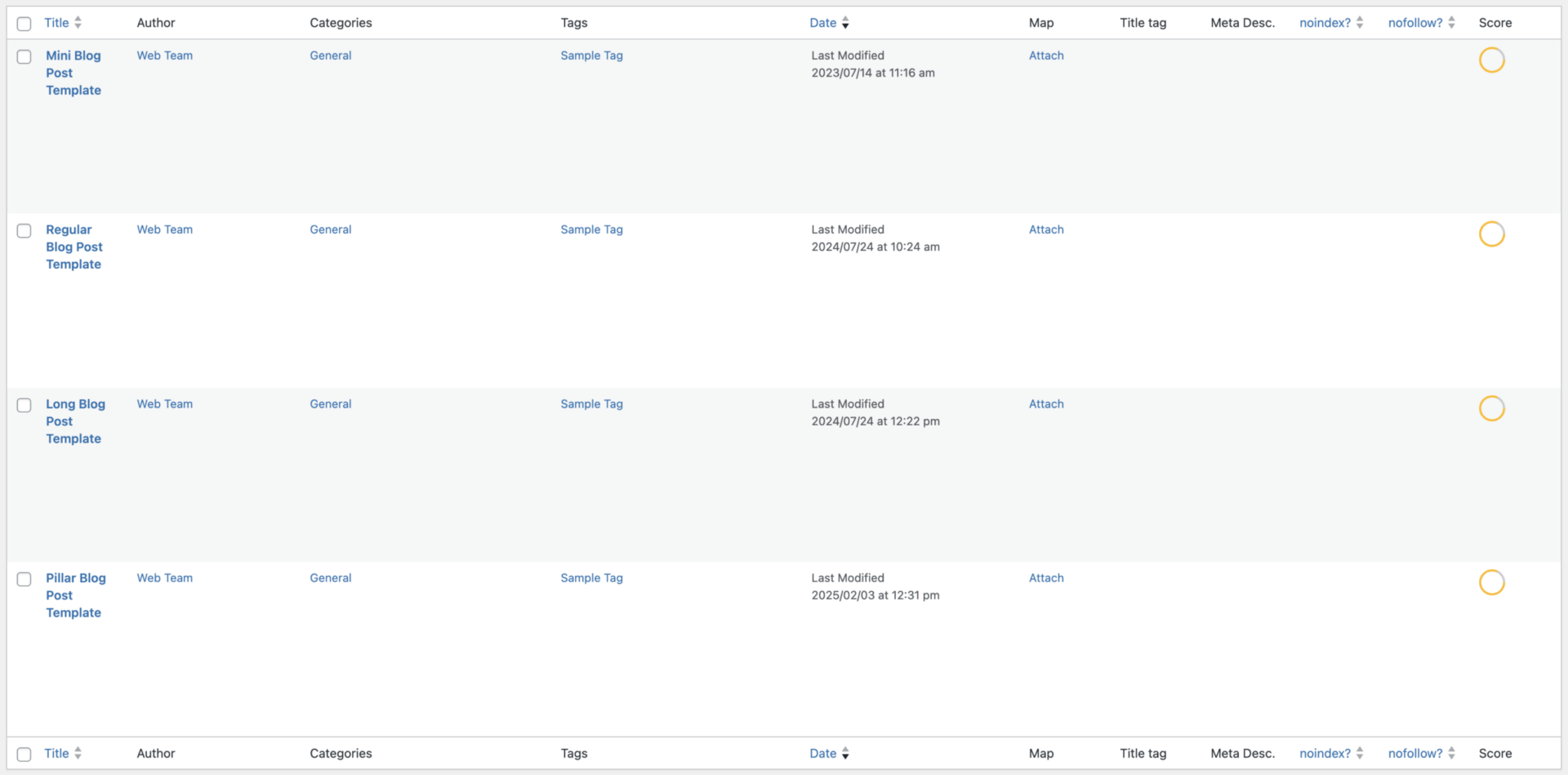
The majority of recent Conversion Machine sites come well equipped with a blog, single post template, category archives, and tag archives that are fully functional, but likely hidden.
This means that there will be, at this time, 4 draft posts available as post templates that can be used as needed by OTT to work their magic with the blogs.
Ideally, our team catches this before a client’s blog goes live.
Our older sites may not have functional blog pages or templates. We previously worked on a mentality of ‘if we don’t need it, delete it’, which has since been changed, but for those sites there are a few additional steps.