This section focuses on day 1’s learning. This includes working on Conversion Machine sites and pages, common scenarios that come up, and other important nuances.
Going along with our training session, now we’ll be going over some key navigation elements including but not limited to:
What gets updated where
The differences between the different navigation elements
Managing lots of links
When design or dev needs to step in vs when they aren’t explicitly needed
Header & Main Navigation
In most cases, OTT and other team members will not need to modify anything in the Header itself, but are more likely looking to make adjustments to the main navigation links.
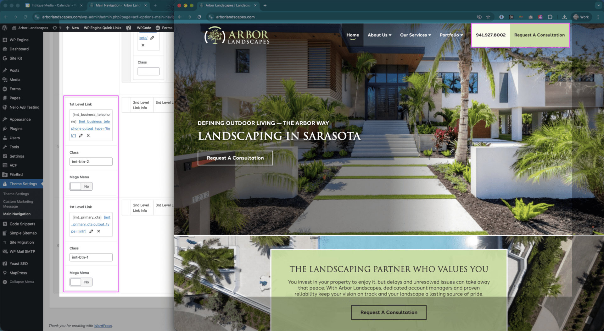
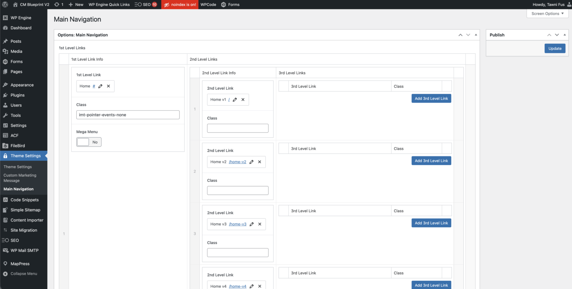
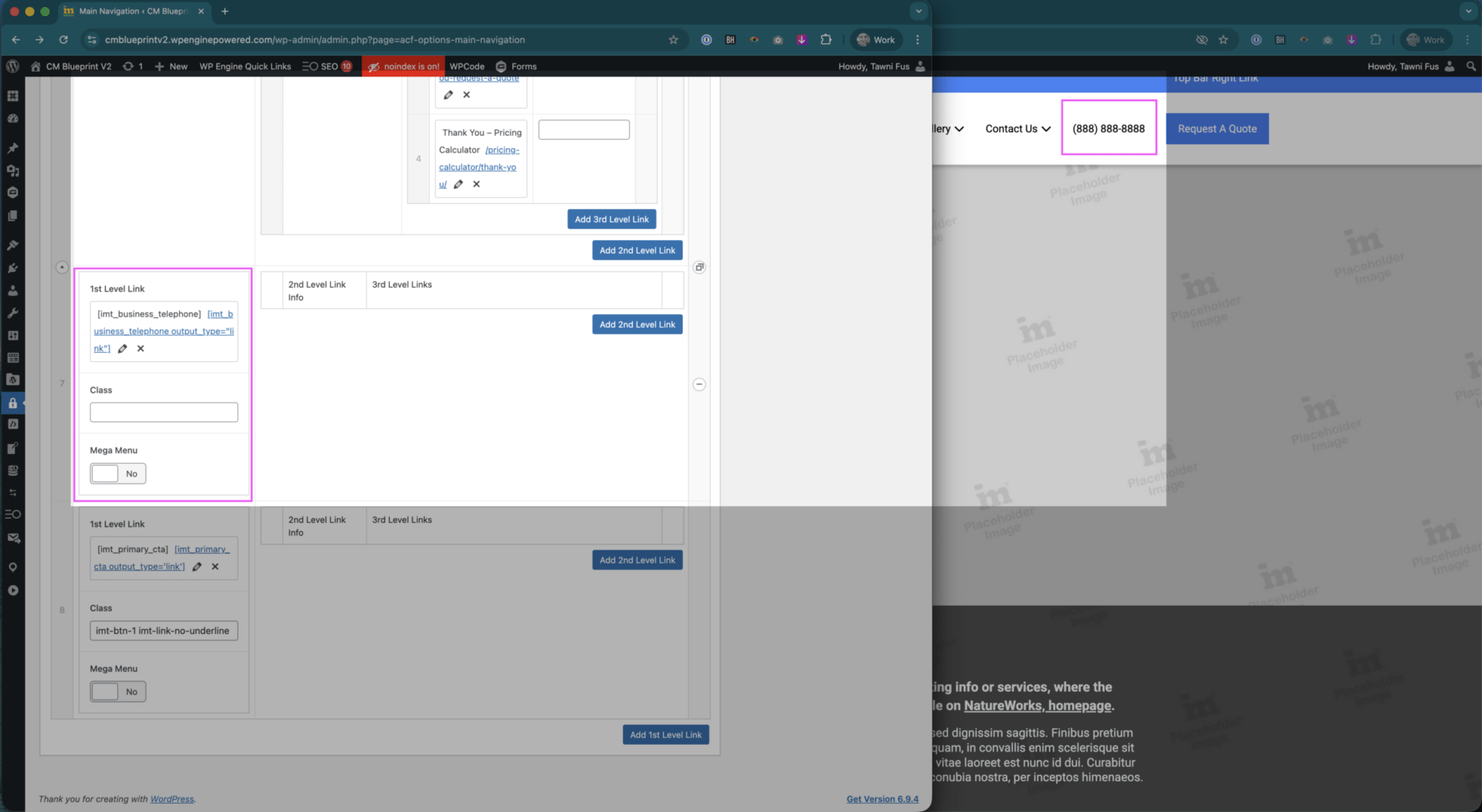
This can be done by navigation to the backend of a site, or adding /wp-admin after the main URL, and selecting Theme Settings > Main Navigation.
You should see the above screen, or a similar layout based on the client’s menu bar structure.
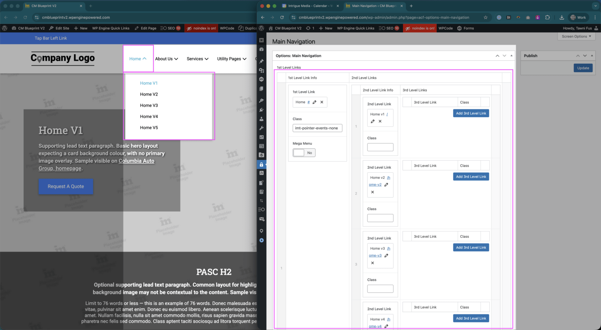
1st Link Level items are the parent navigation items.
2nd Link Level items are your classic dropdown items – hover parent link, see a submenu.
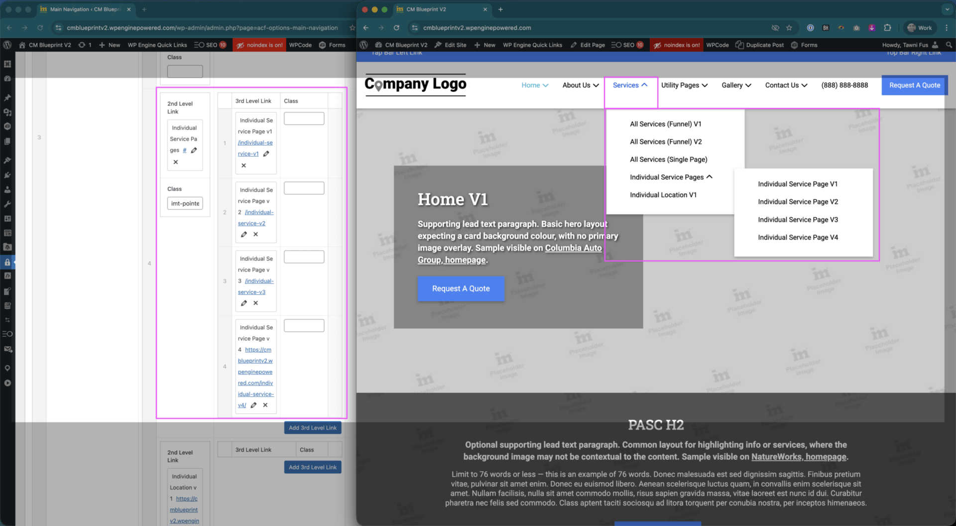
3rd Link Level items come into play when a client has sub-services, and also play an important role in megamenu structures. More to come on those.
🚨 Short Attention Spans
Typically, we cap parent links at 7. Why? Not only are we goldfish with short attention spans, but we also run the risk of links wrapping onto a 2nd line before the tablet and mobile breakpoints.
🚨 The Recency Effect
It is generally recommended to include the most important links you want someone to remember at the start or end of the links, as the ones in the middle run the risk of being more forgotten the more items there are. We want to keep users on goal, not getting confused, lost, or otherwise forgetful.
Regular Links
Your most basic link, expecting a default, hover, and likely an active state unless it’s something that isn’t an actual page, like a phone number.
Set the link and link name as desired. Make sure to press Update Link.
🚨 Did you know?
When the link name and address fields are blank, if you click a page from the site in the scrolling list of pages below, it will auto-populate the name and URL to match what was set.
If you leave only 1 of them blank, only that field will auto-populate.
Dropdown Links, 2nd level
Dropdown links are where we get into 2nd level links.
One important thing to remember when setting these up is to ensure the parent link’s URL is set to #, so that it cannot possibly link to anything, and that the class imt-pointer-events-none is added. This will ensure the correct user experience for dropdowns. This should be added to any link acting as a parent link.
🚨 Don’t forget:
You can drag links around on the same level, but cannot move them from 1 parent link to another.
Dropdown Links, 3rd level
Following the same logic, you can add a 3rd level, popout style dropdown for additional items. We do not typically need to do this for clients, but periodically add CSS overrides to help support this on a client’s site by displaying the links inline, instead of popout. Intrigue, Hoffman, and Shoreline are good examples of this.
🚨 Don’t forget:
We don’t have clickable parents because you need to click the parent to uncollapse the menu on mobile, and if that parent is clickable, then only the dropdown arrow would work for that functionality. This can also create a poor UX due to smaller click targets, meaning someone may navigate to the page before they’re able to expand the menu.
If you’ve ever clicked to a page instead of expanding a menu on another mobile experience, this is the likely cause!
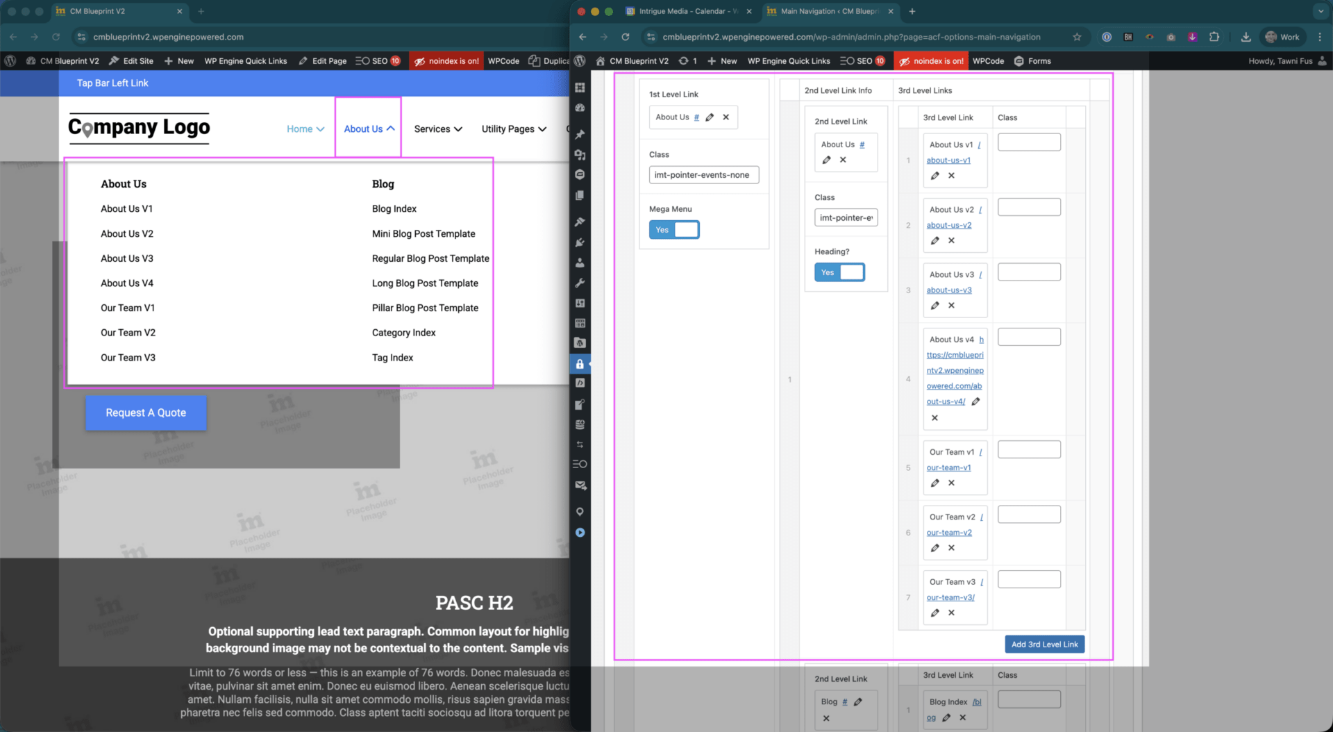
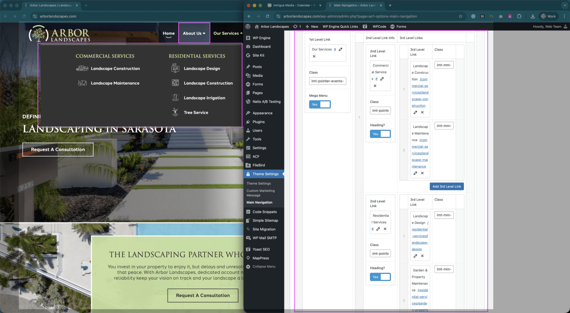
Introductory Megamenus
Megamenus have a bit more nuance, but are overall very similar to other types of dropdowns, but with the addition of the switches that go from regular dropdown to treating the 2nd and 3rd level links as components of the megamenu.
With the Mega Menu setting turned on for the 1st Level Link, you then treat the 2nd Level Links as megamenu headings. This is best practice as if this is not set, the 2nd level link items will NOT be clickable by the user.
When Heading? is turned on, make sure those items receive the same treatment as a parent dropdown item: # for the URL, and the added imt-pointer-events-none class.
The 3rd Level Links become the items that list under your heading.
🚨 Don’t forget:
You can drag links around on the same level, but cannot move them from 1 parent link to another.
Custom Megamenus – QUEUE UP DESIGN
When we get into adding icons, this needs to go to design as this is managed through a mix of image uploads and classes. While these can be adjusted by OTT, it’s typically better to send requests to design unless you’re only swapping 2 existing icons, and have approval to do so from the client. E.g. the 2 Landscape Construction icons needed to be swapped. This can be done by adjusting the classes used for each, without the need for design support.
If we have a megamenu split into multiple columns, how many columns it is split into and at what point the columns split is handled using overrides and require design support to make modifications.
Unique Styles – QUEUE UP DESIGN
These are typically managed by adding a class imt-btn-1, imt-btn-2, or imt-btn-3. These function identically as other parent links, but can be used as a visual distinguisher from other links in a menu to call attention to them.
In most cases, these should not need to be adjusted after a site has gone live, but if we styled it, set it up, removed it, and need it back at a later time, the classes should be able to be added again without issue.
If you notice a visibility or other display issue when using these, please submit a case for design support.
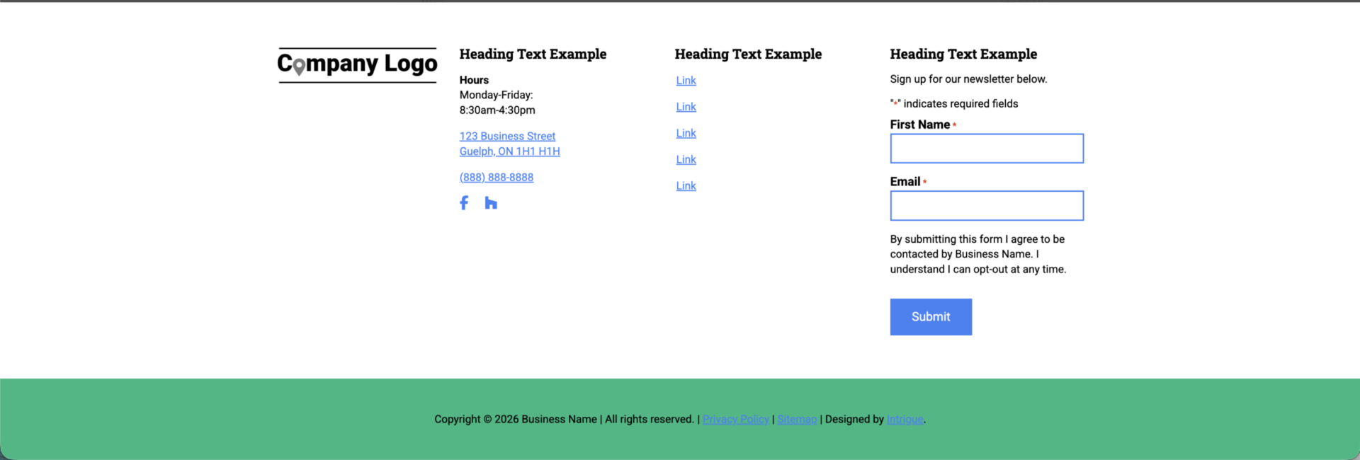
The Footer
The footer is most easily accessible via the admin backend, Appearance > Editor > Patterns.
The footer is overall very simple to keep updated, as this is set up during the initial design portion of the build. Links are managed in button groups within the footer, set as Text. They can be moved around, added, and updated as you would experience in other button groups.
These links are NOT connected to the main navigation, and need to be manually updated.
If you need to add additional column, fix spacing, have removed a card and need to fix spacing for the columns, please loop in design.
The client’s business information pulls in from the Theme Settings > Theme Settings, so if the address, phone number, hours, etc. are adjusted, these will update automatically.
🚨 Did you know?
When we have Mariani clients, the footer needs to say Mariani Enterprises, LLC., but all of the other client business name instances do not need to be. In the bottom bar section where the copyright text exists, you can replace the shortcode [] content of imt_copyright with:
To make this change, no developer support required!
Footer Headings
These are typically set up by design during the build process, but can be manually adjusted to suit the correct language direction of the site if these do not match.
🚨 Reminder:
Try not to leave links blank in any capacity when adding them – always add a # to the URL, or some other placeholder text to avoid the risk of fatal errors on our sites.