Complex field types typically come into play once we need to:
When it comes to forms, generally we work with single-page forms, because client’s only need to capture a particular set of information.
Every so often, clients are looking to capture larger volumes of conditional information, or just a larger volume of information in general.
Once we find ourselves in this situation, it’s beneficial to start looking at organizing the information into different sections or pages to keep information short, targeted, and more easily digestible for users to support a guided experience, rather than throwing everything at the wall and hoping it sticks.
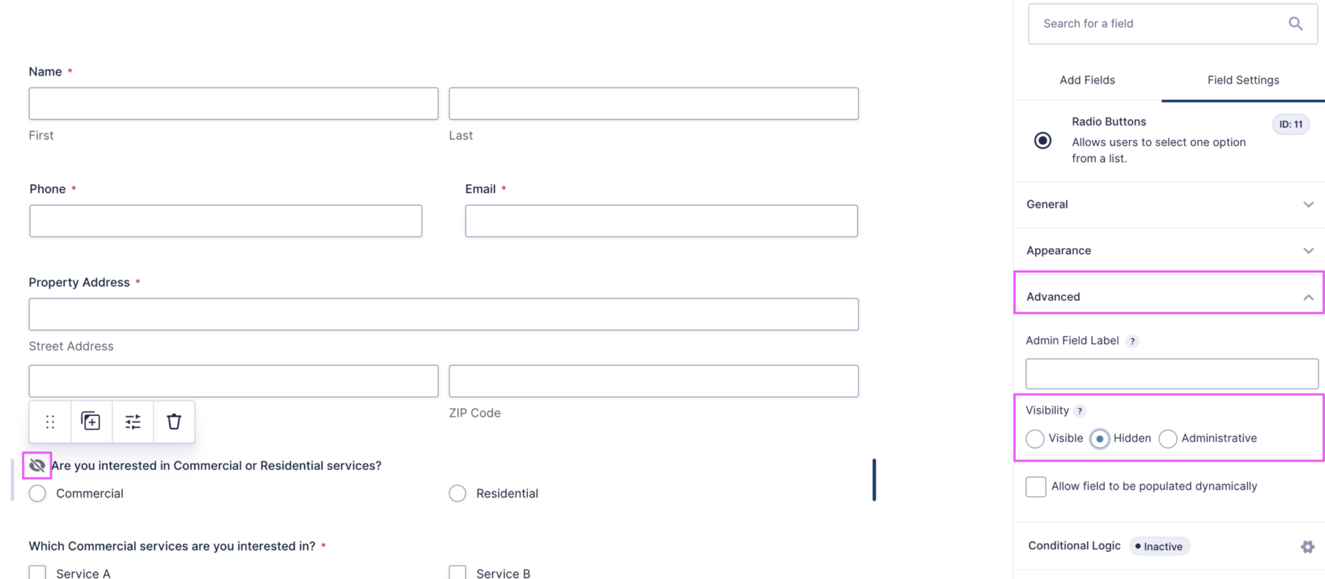
Under a field’s Advanced settings, you can set the visibility to Hidden. This will hide the field from the front end view of the form, but the field will still be included in the submission data and notifications.
This means that if we have 1 hidden ‘Please select your budget’ field as a dropdown, and 1 ‘Please select your budget’ as a text field, both will still be sent with the form notifications and potentially cause issues, especially if the dropdown field has a pre-selected option.
Forms should be santized and have these duplicate fields removed, unless we intend to reactivate the field in the future and do not wish to lose its data. Typically we do this based on:
Setting fields to Hidden will hide the field from the front end view of the form, but the field will still be included in the submission data and notifications.
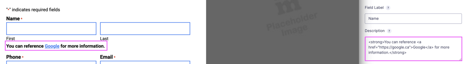
Hyperlinks and other HTML tags used in formatting, such as <strong>, can be used to format additional important elements in a form field’s description, but should be used sparingly as we want users to stay focused on the form they are filling out.
It’s better practice to add a custom HTML field, like our “I agree…” field if we need to do this, but there can periodically be situations where we may want to modify the display further. We did some formatting like this for Woodlawn Memorial Park, and Cloud 9 AV I believe to help additionally format pieces of information.
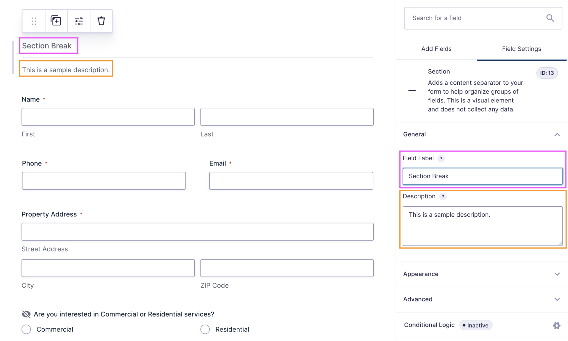
Listed under Standard Fields, this option allows you to divide your form fields across sections to help organize related fields together, and are equally as beneficial to introduce the information presented when fields are split across multiple pages.
Above is a sample of a form we’ve built, utilizing 2 section fields to communicate different pieces of information.
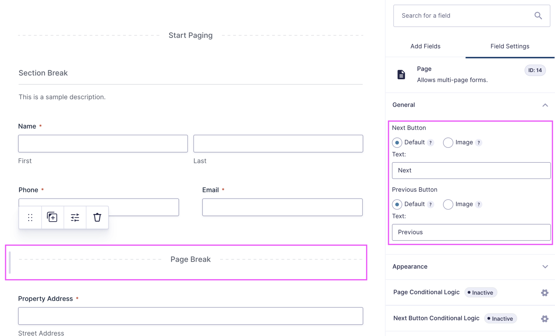
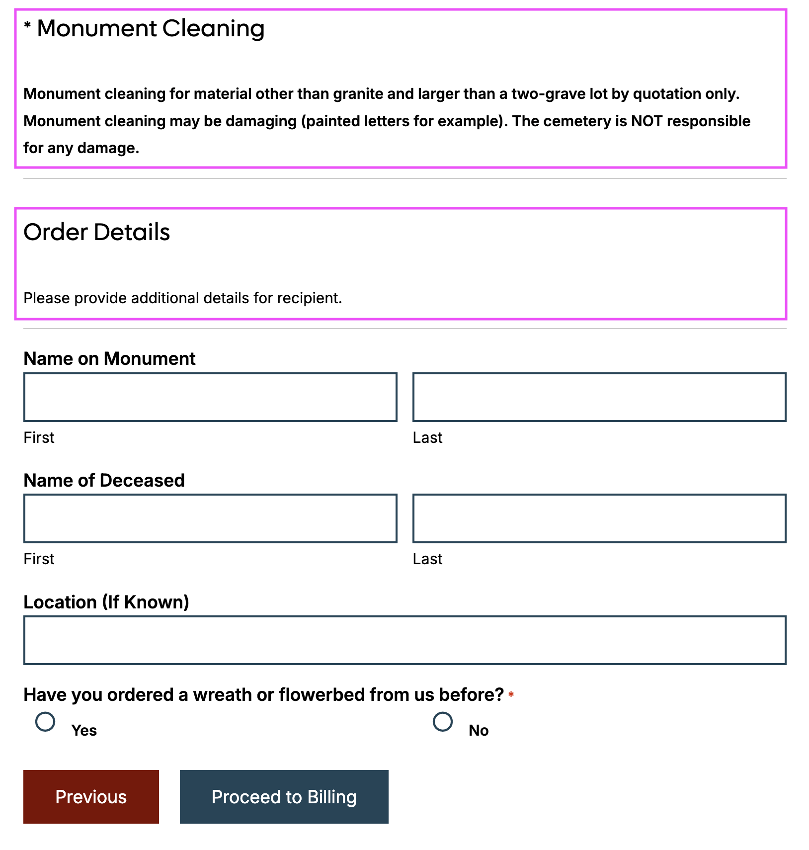
Listed under Standard Fields, this option allows you to divide your form fields across pages to help organize related fields together or showing/hiding different sets of questions depending on conditional logic.
Pagination is useful to make vertically shorter forms, and are generally beneficial when we want to keep a form short, such as for using in a hero, or for breaking information into similarly sized blocks to show different sets of questions at different times.
You can customize the buttons to use relevant language, e.g Proceed to Billing Information, Proceed to Order Quantity.
For usability and accessibility, we leave these set to Default, and generally only modify the language as relevant.
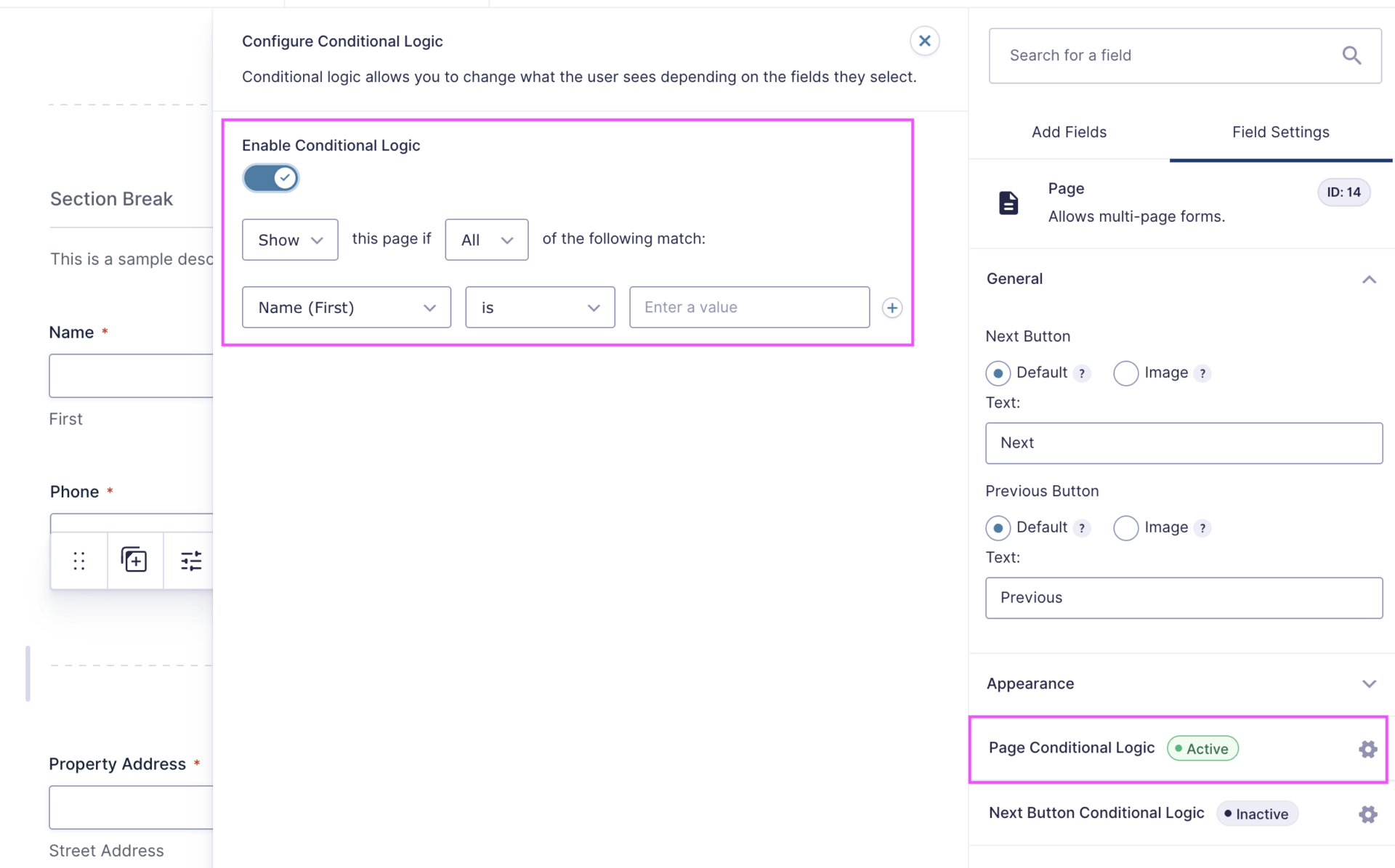
You can set the page of a form to show only if a particular condition or set of conditions are met.
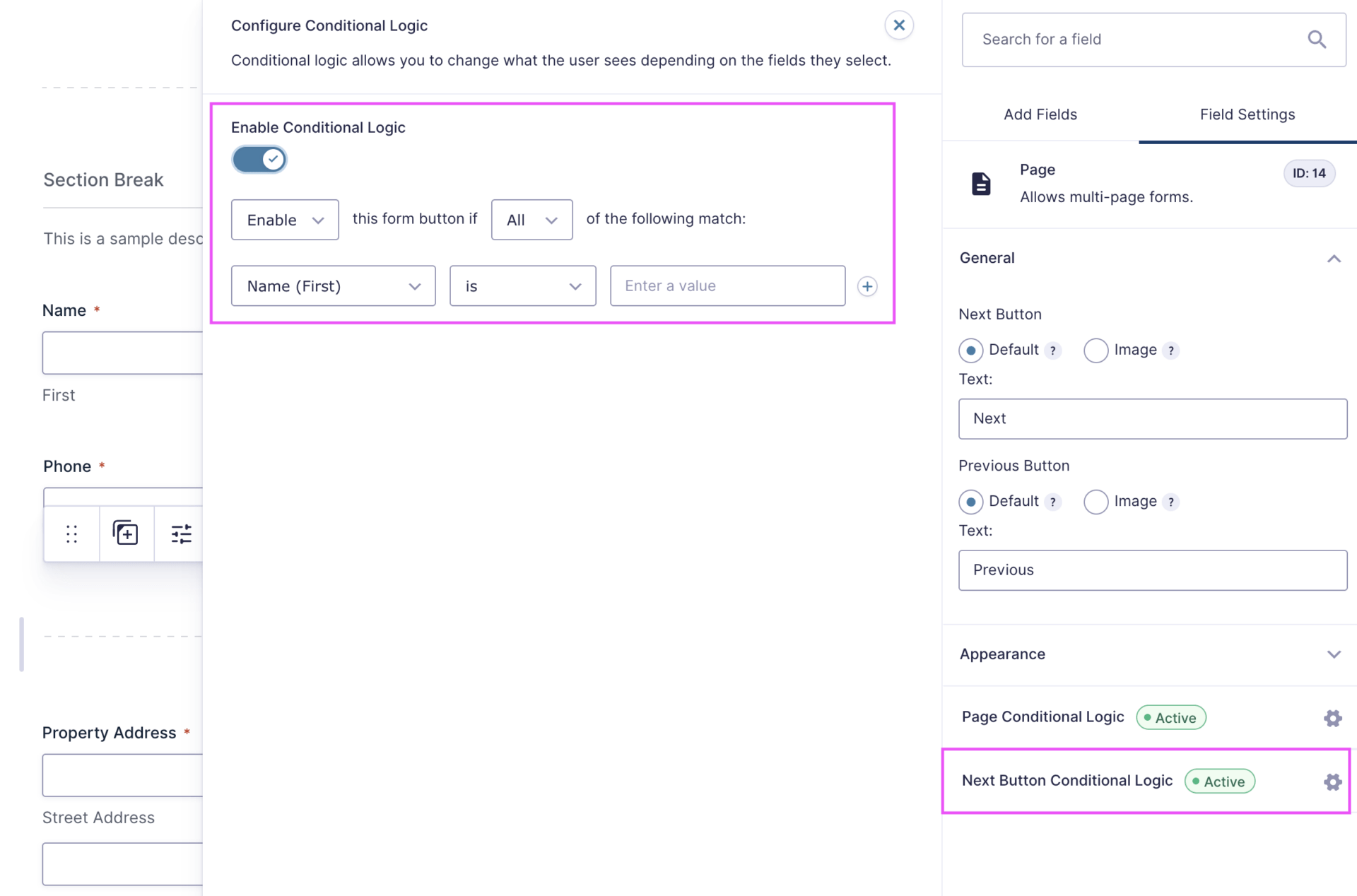
You can also set the next button of a page to show only if a particular condition or set of conditions are met.
Sections and pagination are useful for grouping complex or large volumes of information into better digestible chunks, but can cause a user to feel that the form is much longer than it is. Our goal is to get users to convert, and should only be used when relevant or necessary to improve usability and the flow of information.
Conditional logic is great to help show users relevant content, at the right time. If a condition isn’t met, we aren’t asking them questions that may cause them to stop filling out the form because we’re asking for something like a maintenance budget, when what they want is a landscape installation.
PINK – Activating conditional logic is done by selecting Conditional Logic from a field’s settings, and turning on the switch.
ORANGE – Typically we are changing All to Any, to ensure that a user does not, for example, need to select 3 options in order to meet the condition, but rather they could select any of the 3 options and be shown that next field.
The Show option to the left can be switched to Hide, but generally, you want to conditionally expand a form to ask more detailed questions, not show everything and then remove. We do not generally recommend changing this outside of specific requests.
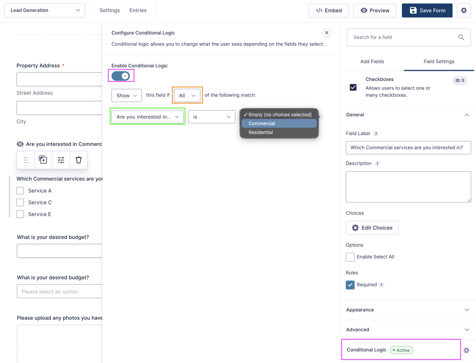
GREEN – You can select the question you are looking for someone to match a value for. Typically we are looking for something to the effect of matching that someone has selected a particular service category, but could also create logic around if someone selects a particular service (Maintenance), they see a Maintenance Budget field, whereas if they select other services, they would see a Service Budget.
Conditional logic can be applied to a field that is only visible conditionally, to build deeper levels of connection. While we should always be mindful of including too many or too few questions, this can be useful when clients have a split of Commercial and Residential audiences, and then different budget ranges depending on a type of service.
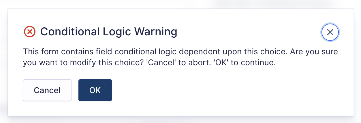
If you have conditional logic attached to a specific selection, you will need to update the conditional logic condition should that selection change. Gravity Forms should prompt you, but if you forget to make the change, it will break your logic. Proceed with caution, care, and attention to detail.
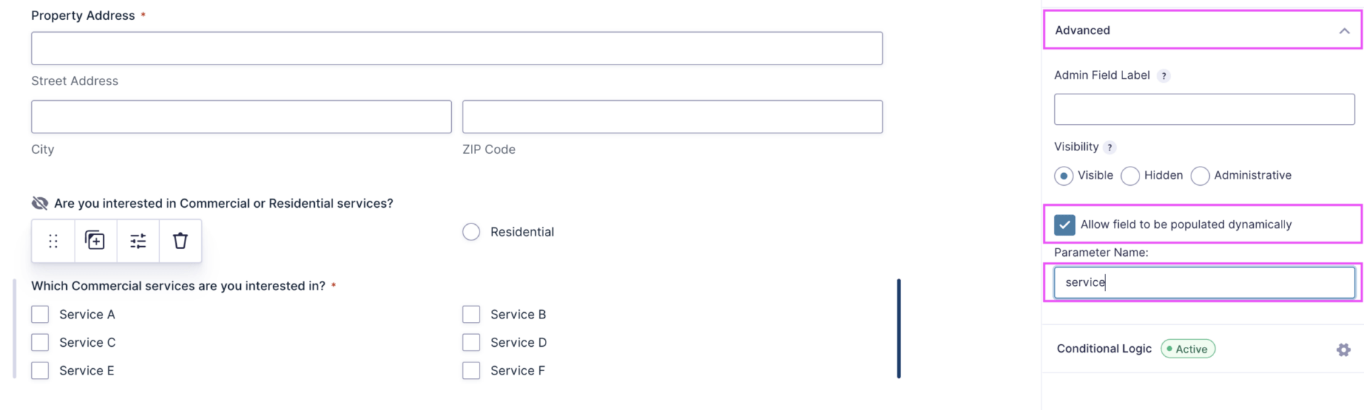
Fields can be dynamically populated, meaning when someone clicks a button from Page A, when they land on the Form Page B, whichever options we passed through will already be selected for the user.
This can be added to the imt_primary_cta shortcode by adding the parameter string:
https://university.intriguemediapowered.com/membership-account/?service=Service%20A
where service becomes the parameter name,
and Service A becomes the option that should be preselected when clicked.
Additional parameters can be added by ¶meter=Value Name, these are often needed if we need to pre-select a value like Commercial, and then a particular service.
You can read more here on known limitations of dynamic population.

If the selection name or parameter name changes, any URLs will need to all be manually updated to match.
& are not accepted characters for values, and need to be changed to ‘and’ in order to be added and function as expected.
Dynamic population cannot occur if the form exists on the same page as the button or link being clicked.
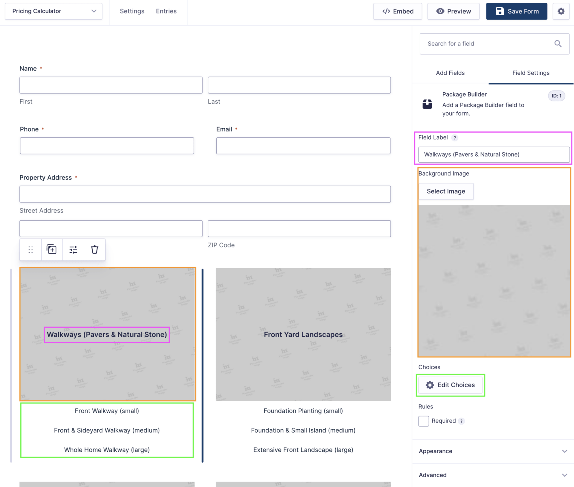
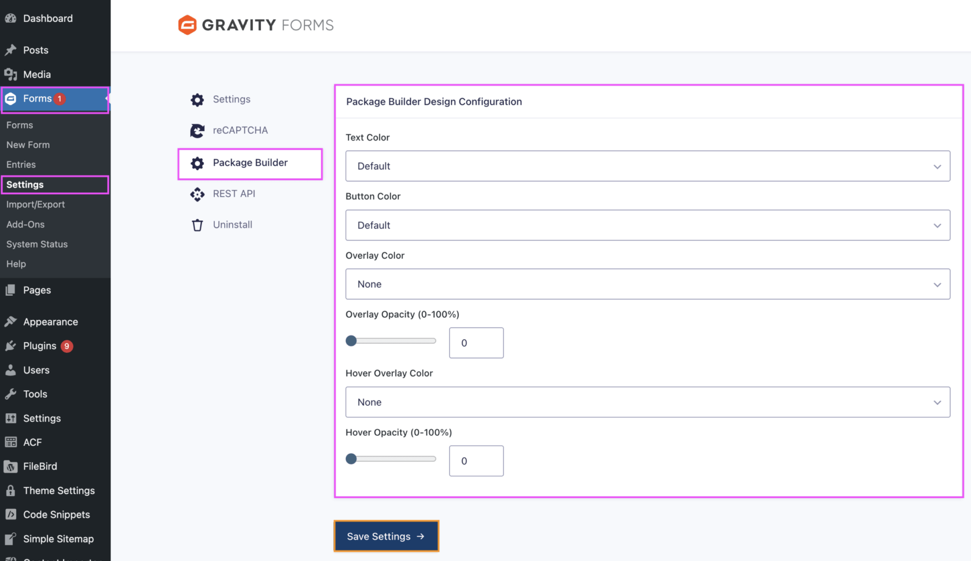
Creating the Package Builder currently lives with Development.
This walkthrough is intended to provide more clarity on the pieces of information, so the team has an intial introduction as this gets better incorporated into our process.
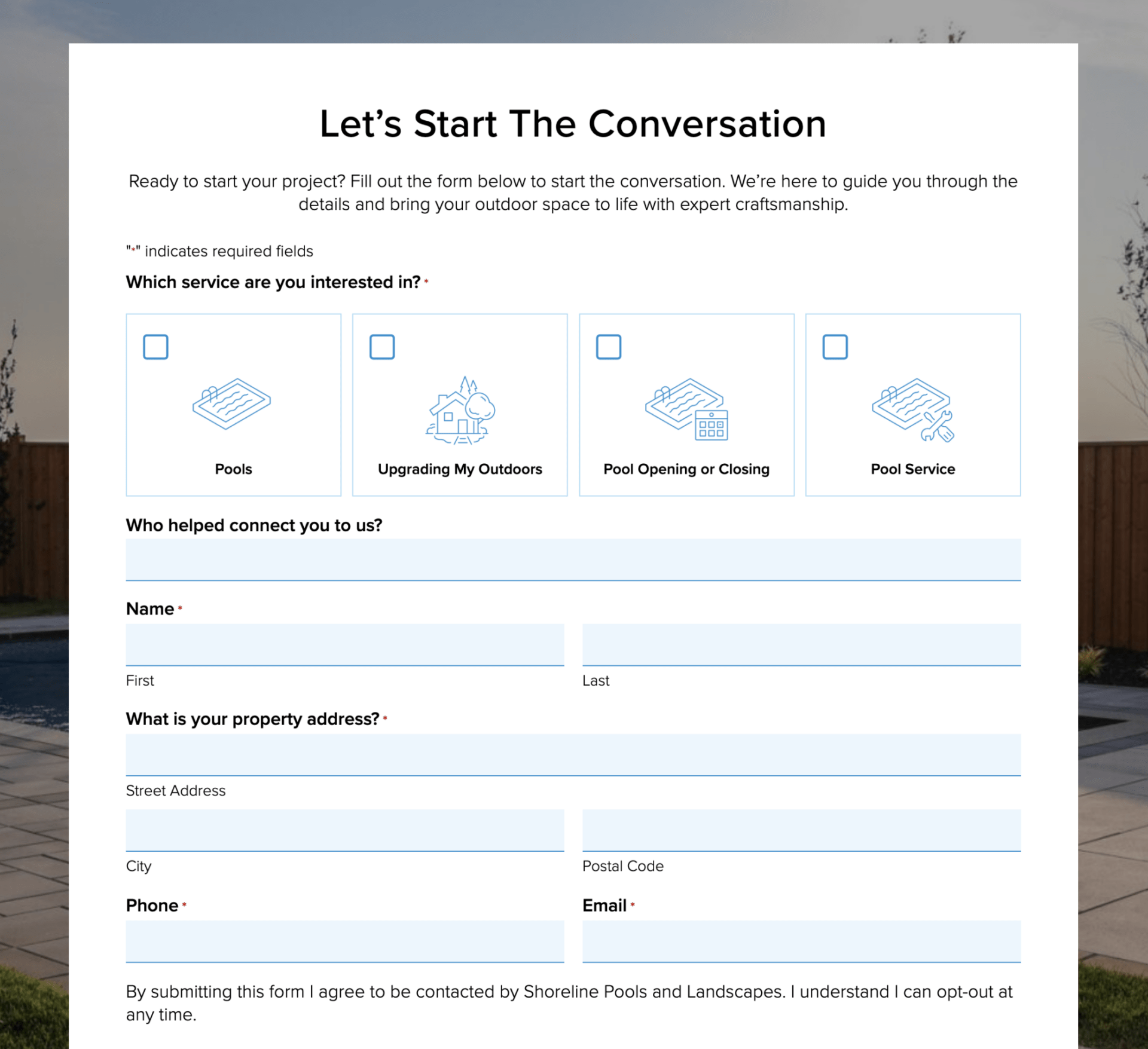
The source of information for these forms is based on client-provided information added to a Google Sheet, similar to this example.
PINK – This label field acts as the text that indicates, typically, the service category.
ORANGE – This field is the single image that will show up behind all potential options.
GREEN – These are the options set up for each package option.
The other settings should not be modified as these will affect the display. Styling the Package Builder is handled elsewhere.
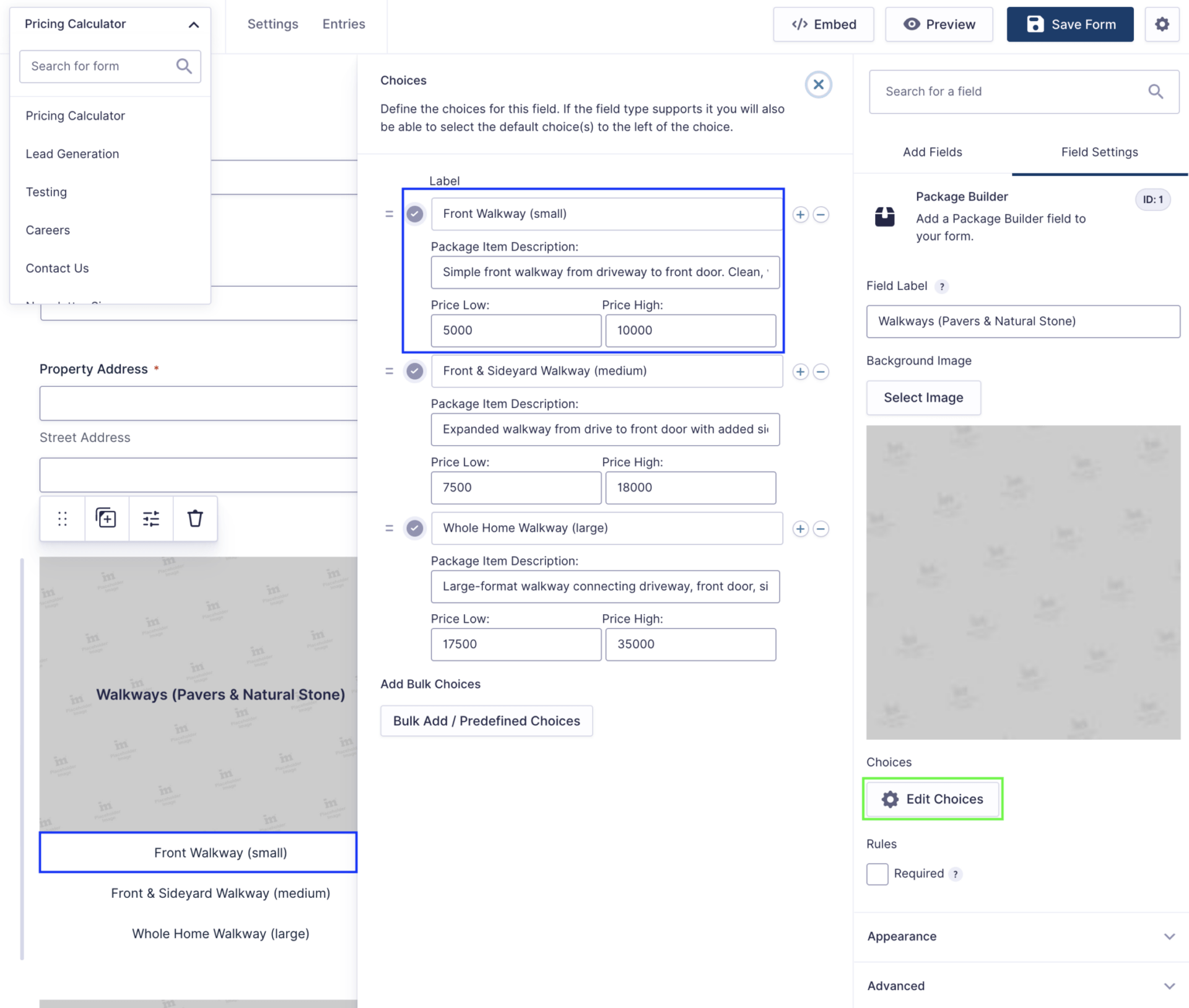
Once you select Edit Choices, you will get a pop out that mirrors the regular checkbox, dropdown, and radio button settings, with additional field options for:
All of this information is informed by the client-provided document.
Right now, we recommend limiting to 3 options, though in the future we can re-assess to determine if more than 3 (or fewer) need to be provided.
The Package Builder field has default styles that can be assigned to all fields of the same type, to make styling them much easier.
These can be found by navigating to Gravity Forms > Settings > Package Builder.
Text Color modifies the text color over the image.
Button Color modified the color of the selectable options.
Overlay Color and Overlay Opacity sets the default overlay color and opacity behind the Text Color set. Be mindful of your selections for legibility.
The Hover options do the same, when an option is hovered over.
Heavily customized, we do not actively recommend these unless:
These form styles use icons set via child-styles, and need to be updated by a designer and cannot be adjusted via the form editor at this time.
These are best set with a default and hover/focus icon, to align with the form experience.
These overwrite the radio buttons and/or checkboxes set in the form, which will then require the addition of the imt-standard-checkbox or imt-standard-radio classes in order to display the correct style and layout as expected.